SCHÜWO
2026
SCHÜWO
Packaging Design
Concept Redesign
Remote
NAEL
Product Concept + Visual Identity + Packaging
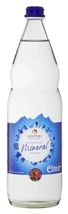
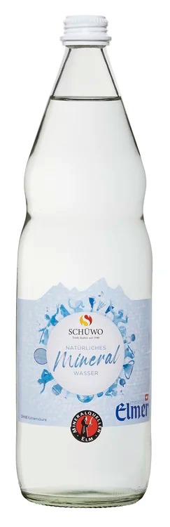
SCHÜWO is an existing Swiss mineral water brand — this redesign was created independently as a design exploration, not a commissioned client project. The idea came from a simple observation: someone who genuinely loved the water itself couldn't quite connect with how it was presented — the packaging felt more decorative than the product needed.
The original design leans on illustrative, ornamental elements that don't necessarily speak to why people reach for mineral water in the first place. A health-conscious buyer isn't won over by decoration — they're looking for clarity, purity, and calm: something that reflects the simplicity of water itself and a mindful relationship with the body.
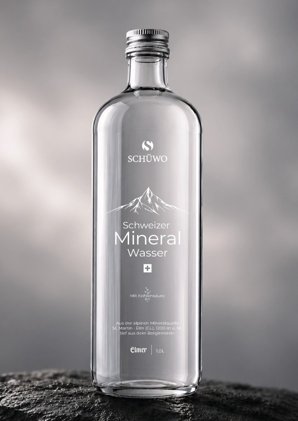
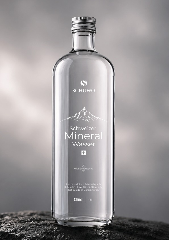
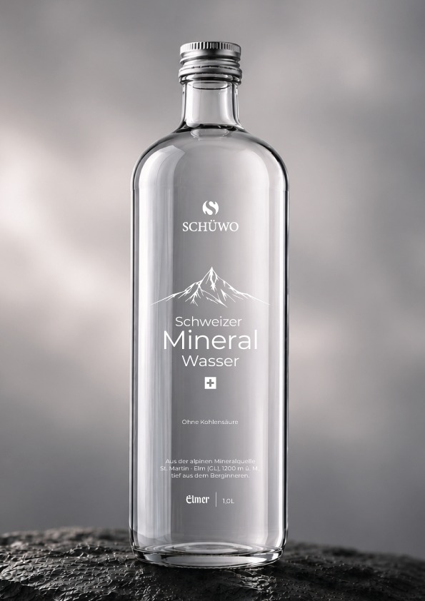
The concept replaces the original label with type printed directly onto clear glass, so the water itself stays visible — the product becomes the packaging. A minimal mountain silhouette and the Swiss cross anchor the brand in its origin, while a mix of confident serif and clean sans-serif typography gives it an understated, premium feel.
The system covers both variants — sparkling and still — differentiated only by a single line of type, keeping the two feel like part of one considered family rather than competing products.
The result reads as quietly luxurious rather than loud — closer to a fragrance or a spirits bottle than typical mineral water, built to hold its own on a hotel table or a restaurant wine list.
Concept Redesign (Result)
Original Packaging
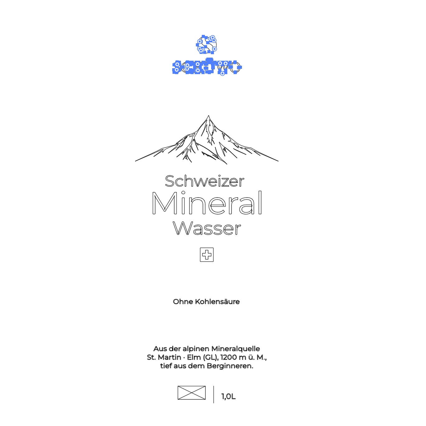
Label artwork, built as vector construction
Self-initiated concept.
AI-assisted visualisation; design concept and visual system by NAEL.